Challenge
Copenhagen Specs, Scandinavia’s largest eyewear trade show, was expanding to Berlin and needed a fresh visual identity that would effectively communicate their mission to support independent opticians. The challenge was to strike the right balance between professionalism and approachability, delivering a message that was informative yet light-hearted.
Solution
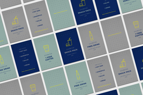
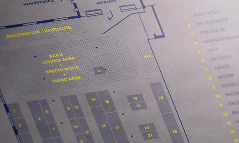
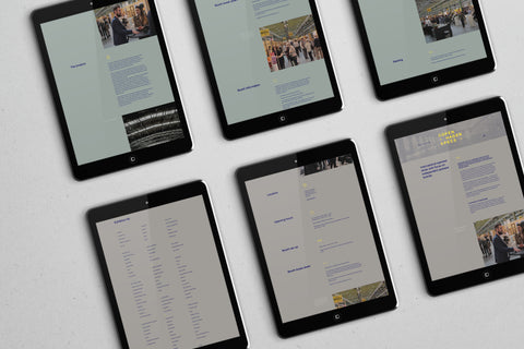
We developed a new visual identity system that reflected Copenhagen Specs' commitment to supporting independent opticians while keeping the tone accessible and fun. Using a down-to-earth approach, we paired a sophisticated grey for Copenhagen with mint for Berlin, accented by soft midnight blue and a touch of the original yellow. Over 40 custom icons helped tell the story, with a dotted pattern symbolizing the masses and one yellow dot representing independence. The design system was applied across all materials, from the website to printed signage and magazine layouts, making information easy to digest and visually engaging.
Key Achievements
- Clear, engaging visual identity
- Effective communication of key messages
- Use of playful iconography and colors
- Harmonious integration of event materials
Services
- Brand Identity
- Point of Sale
- Web Design